
5 Critical Housing Indicators Every Policy Advocate Should Monitor
Housing advocates need numbers that tell the truth. Not abstract statistics that look impressive in reports, but metrics that reflect what people experience when they search for a place to live, pay rent, or try to buy a home.
The right indicators show you where the housing market is breaking down. They reveal which communities face the worst pressures. They give you evidence to push for policy changes that actually help.
Housing policy indicators are measurable data points that track affordability, supply, quality, and accessibility in housing markets. Advocates use these metrics to identify crisis areas, measure policy impact, and build evidence-based campaigns. The most effective indicators include rent-to-income ratios, housing production rates, vacancy rates, overcrowding statistics, and homelessness counts. Together, these numbers create a complete picture of housing health in your community.
Why measurement matters for housing advocacy
You cannot fix what you cannot measure. This principle applies to housing policy just as much as it does to public health or education.
Housing advocates often work with limited resources. You need to focus your energy where it will have the most impact. Good indicators help you identify the neighborhoods, demographics, and housing types that need attention first.
Numbers also give your advocacy credibility. When you present data to city councils, housing authorities, or the media, you shift the conversation from opinion to evidence. Decision makers take you more seriously when you can show trends over time, compare your city to similar markets, or demonstrate that a problem is getting worse.
But not all housing data is equally useful. Some metrics sound important but do not connect to real outcomes. Others are so complex that they confuse more than they clarify.
The best housing policy indicators share three qualities. They are easy to understand. They connect directly to lived experience. And they are available consistently over time, so you can track changes and measure whether policies are working.
The core indicators every advocate should track
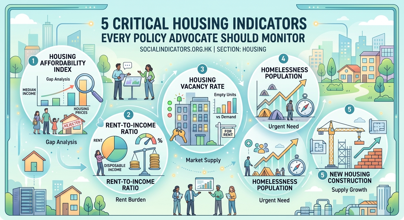
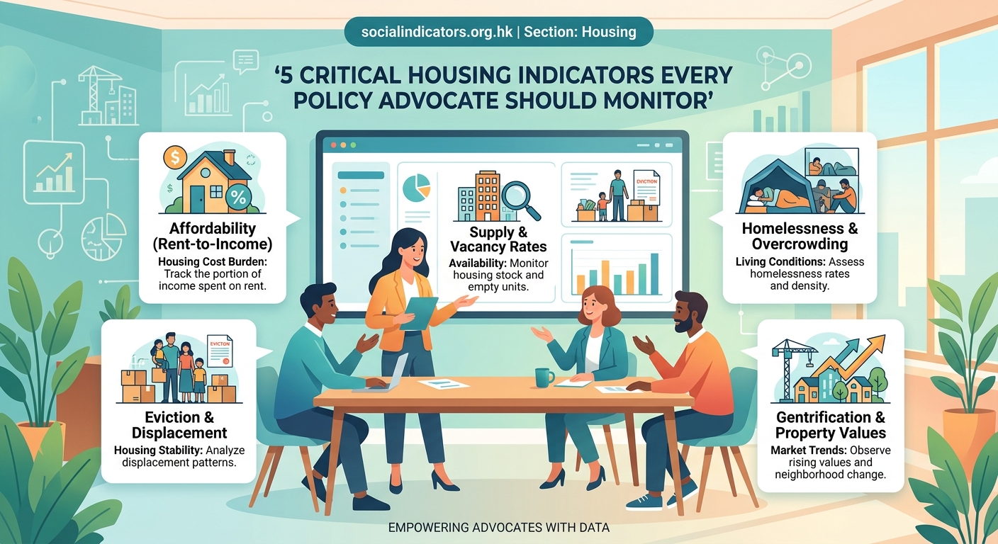
Rent burden and affordability ratios
The most fundamental question in housing policy is simple: can people afford to live here?
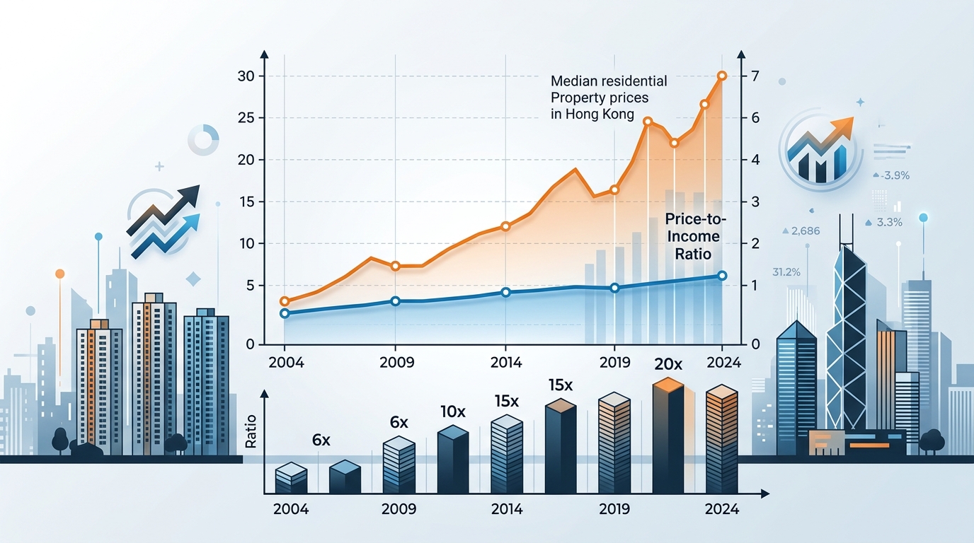
Rent burden measures what percentage of household income goes toward housing costs. The standard threshold is 30 percent. Households spending more than that are considered cost-burdened. Those spending more than 50 percent face severe cost burden.
This indicator cuts through all the complexity of housing markets and gets to what matters. When half your income goes to rent, you have less money for food, healthcare, transportation, and savings. You are one unexpected expense away from crisis.
Calculate rent burden by dividing median rent by median household income. But do not stop at citywide averages. Break the data down by neighborhood, income level, and household type. Single parents often face much higher rent burdens than childless couples. Recent immigrants may struggle more than longtime residents.
Track this metric over time. If rent burden is rising, housing costs are growing faster than incomes. That signals a market heading toward crisis, even if absolute prices still seem reasonable compared to other cities.
Housing production and supply metrics
Affordability problems often stem from supply shortages. When housing production does not keep pace with population growth and household formation, prices rise.
Track the number of new housing units permitted and completed each year. Compare that to your area’s population growth and household formation rates. If your city adds 10,000 new residents but only permits 2,000 new homes, you have a supply problem.
Pay attention to the types of housing being built. Are developers only constructing luxury apartments? Is there new affordable housing? Are single-family homes the only option, or are smaller, more affordable units being added?
Vacancy rates tell you whether supply is tight or loose. A healthy rental market typically has a vacancy rate between 5 and 8 percent. Below 5 percent, the market is too tight. Renters have few choices, and landlords can raise rents aggressively. Above 8 percent suggests oversupply or weak demand.
“Supply metrics are not just about total numbers. They reveal whether your housing market can adapt to changing needs. A city that only builds one type of housing will struggle to serve diverse households.” – Housing policy researcher
Overcrowding and quality indicators
Affordability is not just about cost. It is also about getting adequate space and safe conditions for what you pay.
Overcrowding happens when too many people share too little space. The standard definition is more than one person per room (excluding bathrooms and kitchens). Severe overcrowding means more than 1.5 people per room.
This indicator often reveals hidden housing crises. When rents rise faster than incomes, families double up. Multiple generations share small apartments. Unrelated adults become roommates out of necessity, not preference.
Overcrowding affects health, educational outcomes, and quality of life. Children struggle to find space for homework. Disease spreads more easily. Privacy becomes impossible.
Track overcrowding rates by neighborhood and demographic group. Immigrant communities and low-income families often experience the highest rates.
Housing quality metrics include the percentage of units with serious maintenance deficiencies, lack of complete plumbing or kitchen facilities, or code violations. These numbers are harder to collect than rent data, but they matter enormously to residents.
Homelessness counts and housing insecurity
The most visible sign of housing system failure is homelessness. Annual point-in-time counts measure how many people are experiencing homelessness on a single night, typically in January.
These counts are imperfect. They miss people who are couch surfing, staying in motels, or living in vehicles in areas not surveyed. But they provide a consistent baseline for tracking trends.
Pay attention to the composition of the homeless population. How many are chronically homeless versus newly homeless? What percentage are families with children? Are veterans overrepresented?
Also track eviction rates and eviction filings. These are leading indicators of housing instability. High eviction rates signal that many households are on the edge, even if they are not yet homeless.
Housing insecurity includes people who are at risk of losing housing, moving frequently due to affordability problems, or living in severely inadequate conditions. Surveys can capture this broader group.
Homeownership rates and equity gaps
Homeownership builds wealth and provides stability. Tracking homeownership rates by race, ethnicity, and income reveals who has access to these benefits.
In most cities, significant homeownership gaps exist. White households own homes at much higher rates than Black, Latino, or Asian households, even when controlling for income.
These gaps reflect historical discrimination, ongoing bias in lending, and wealth inequality that makes it harder for some groups to save for down payments.
Track not just overall homeownership rates but also:
- First-time homebuyer rates
- Mortgage denial rates by demographic group
- Median home values by neighborhood
- Property tax burdens relative to home values
Changes in homeownership rates can signal market shifts. Rising rates may indicate improving affordability or expanding access to credit. Falling rates might mean homes are becoming less affordable or lending has tightened.
How to use indicators strategically
Collecting data is only the first step. The real work is turning numbers into action.
- Establish baselines by documenting current conditions before you launch a campaign or policy change.
- Set specific targets for improvement, such as reducing rent burden from 45 percent to 35 percent within five years.
- Monitor trends regularly, updating your key indicators quarterly or annually to catch changes early.
- Compare your community to similar cities to understand whether your problems are unique or part of broader patterns.
- Communicate findings clearly using charts, infographics, and plain language that non-experts can understand.
- Connect data to stories by pairing statistics with real examples of how housing challenges affect individuals and families.
Different indicators serve different advocacy goals. Use the table below to match metrics to your objectives.
| Advocacy Goal | Primary Indicators | Why They Matter |
|---|---|---|
| Increase affordable housing production | Housing units permitted, affordability by unit type | Shows the gap between need and supply |
| Reduce rent burden | Rent-to-income ratios, wage growth vs. rent growth | Demonstrates affordability crisis severity |
| Prevent homelessness | Eviction rates, housing insecurity surveys | Identifies households at risk before crisis |
| Address housing quality | Code violations, overcrowding rates | Reveals hidden problems that cost data misses |
| Promote fair access | Homeownership gaps, mortgage denial rates | Exposes inequities in housing opportunities |
Common mistakes when working with housing data
Even experienced advocates sometimes misuse housing indicators. Avoid these pitfalls.
Using averages that hide disparities. Citywide median rent tells you nothing about what low-income families face. Always disaggregate data by income, race, and geography.
Confusing correlation with causation. Just because two trends move together does not mean one causes the other. Rising rents and increasing homelessness are correlated, but the relationship is complex.
Ignoring data quality issues. Some housing data comes from small samples, outdated surveys, or inconsistent definitions. Understand the limitations before you cite numbers publicly.
Focusing only on inputs, not outcomes. The number of affordable units built matters less than whether people can actually afford to live in them. Always connect supply metrics to affordability outcomes.
Comparing incomparable cities. Your city’s housing market may function differently from others due to geography, economy, or regulations. Context matters when making comparisons.
Building your indicator dashboard
You do not need to track every possible metric. Start with a core set that matches your priorities and expand over time.
Create a simple spreadsheet or dashboard that you update regularly. Include:
- Three to five primary indicators that align with your main advocacy goals
- Historical data going back at least five years to show trends
- Breakdowns by key demographic groups and neighborhoods
- Sources and update schedules for each metric
- Notes on data quality or definition changes
Many cities publish housing data through open data portals. Census data provides national consistency but comes out slowly. Local housing authorities, planning departments, and academic institutions often have more timely information.
Partner with researchers when possible. Universities often need community connections for their housing studies. You provide local knowledge and access. They provide analytical capacity and credibility.
Making data accessible to your community
Housing policy indicators should not stay locked in reports that only experts read. Your job is to make the numbers meaningful to the people most affected.
Use visuals that show trends at a glance. A simple line graph of rising rent burden over ten years tells a powerful story. Maps that highlight neighborhoods with the worst overcrowding help people see geographic patterns.
Translate statistics into concrete terms. Instead of saying “median rent is $1,500,” say “a family earning median income would need to work 60 hours per week at minimum wage just to afford median rent.”
Connect data to decisions. When the city council considers a new development, show how it would affect your key indicators. Would it reduce rent burden? Add to the supply of affordable units? Serve households currently facing overcrowding?
Host community data sessions where residents can ask questions and share their own experiences. Numbers gain power when people see their lives reflected in the statistics.
Indicators that drive change
Housing policy indicators are not academic exercises. They are tools for creating change.
When you can show that rent burden has increased 15 percentage points in five years, you make the case for rent stabilization policies. When you document that your city permits only 20 percent of the housing it needs, you build support for zoning reform. When you prove that eviction rates are highest in majority-minority neighborhoods, you expose inequities that demand attention.
The numbers give you leverage. They turn housing from a political debate into a measurable problem with trackable solutions. They let you hold decision makers accountable by showing whether their policies improve conditions or make them worse.
Start with the indicators that matter most to your community. Track them consistently. Share them widely. Use them to push for policies that make housing more affordable, more available, and more equitable. The data will show you where to focus. Your advocacy will determine what changes.
Post Comment