What the 2026 Consumer Price Index Revisions Tell Us About Hong Kong’s Hidden Inflation Burden
In August 2026, the headline Consumer Price Index for Hong Kong rose just 0.10%. That sounds like good news. For a city that has seen its share of economic turbulence, a near-flat CPI suggests stability. But if you are an investor, policy analyst, or simply someone who pays rent and buys groceries in Hong Kong, you probably felt something different. That gap between what the official numbers say and what your wallet tells you is not your imagination. It is the result of something we call hidden inflation.
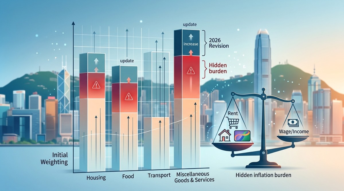
The 2026 CPI basket revisions show that official inflation figures mask a much higher cost burden for low and middle income households. By shifting weights away from essentials like housing and utilities, the updated index paints a rosier picture than reality. Understanding these revisions is critical for anyone tracking Hong Kong’s true cost of living.
Why the 2026 CPI Revision Matters More Than You Think
Every few years, the Census and Statistics Department updates the “basket” of goods and services used to calculate the CPI. This is standard practice. Consumer habits change. New products appear. Old ones fade. But the 2026 revisions arrived at a sensitive moment. Hong Kong’s economy is still adjusting to post-pandemic shifts, population outflows, and a tight rental market. The timing of the revision, and the specific choices made, have a big impact on how we measure inflation.
The official CPI for 2026 shows an annual increase of around 2.1%. That is moderate by historical standards. Yet many households report that their actual expenses have risen much faster. The reason lies in the weights assigned to different categories. When you change the weight of a category that is rising in price, you can make the overall index look lower.
What Changed in the 2026 Basket
The new basket, effective from January 2026, made several adjustments. Here are the most significant shifts:
- Housing weight reduced. The proportion allocated to accommodation (rental equivalents and maintenance) dropped from 28% to 24%.
- Food and non-alcoholic beverages weight trimmed. This category fell from 18% to 16%.
- Transport costs reweighted. Public transport got a lower share, while private car expenses were added.
- Recreation and culture weight increased. This category rose from 5% to 7%.
- Education and communication saw small upward adjustments.
On paper, these changes reflect how people spend their money today. But for the typical renter in a subdivided flat or a young professional in a private rental, the reduced housing weight means their biggest expense is now underrepresented in the index.
The Hidden Inflation Burden in Practice
Let us look at a concrete example. Imagine a household in the bottom 40% of income earners. They spend roughly 40% of their income on rent. The official CPI now assigns only 24% weight to housing. If rents rise by 6% in a year (which is plausible for many districts in 2026), the CPI calculation spreads that increase across a smaller share of the basket. The result? The official number looks lower than the actual hit to that household’s budget.
This is not a conspiracy. It is a statistical artifact. But it has real consequences. Wage negotiations, social welfare adjustments, and even interest rate decisions can be influenced by the CPI. If the index understates inflation for the most vulnerable groups, policy responses will be too weak.
How to Spot Hidden Inflation in Official Data
You do not need to be a data scientist to catch these gaps. Here is a practical process you can follow with publicly available data.
- Download the latest CPI weight table from the Census and Statistics Department. Look for the “CPI Weights by Expenditure Class” document for 2026.
- Identify the weights for the bottom 20% and top 20% of households. The government publishes separate weights for different income groups. Compare them.
- Calculate a simple “personal CPI” for your own spending. Take your monthly expenses and apply the official price changes for each category. See how it differs from the headline number.
- Track rent and utilities separately. These two items often move faster than the CPI average. If your rent went up 8% this year, that alone tells you more than the composite index.
- Look at the sub-indices. The CPI for “Housing” and “Food” are published separately. If those sub-indices are rising faster than the overall CPI, you have found the hidden burden.
What the Data Reveals About Inequality
The gap between official inflation and experienced inflation is not evenly distributed. Lower income households spend a larger share on rent, utilities, and food. These are exactly the categories where price increases have been most stubborn in 2026. Higher income households, by contrast, spend more on recreation, dining out, and international travel. Those categories have seen softer price growth or even deflation in some cases.
| Category | Bottom 20% weight (2026) | Top 20% weight (2026) | Official CPI weight |
|---|---|---|---|
| Housing | 38% | 18% | 24% |
| Food | 24% | 10% | 16% |
| Transport | 8% | 6% | 7% |
| Recreation | 3% | 12% | 7% |
| Education | 2% | 5% | 4% |
This table shows a clear pattern. The official CPI weight sits somewhere in the middle, but it is closer to the spending habits of higher income households. When official inflation is 2.1%, the bottom 20% may be experiencing something closer to 4.5% or 5%. That difference compounds over time.
“The CPI is an average, and averages can hide a lot. For policy purposes, we need to look at inflation by income decile, not just the national figure.” – Dr. Karen Ng, economist at the University of Hong Kong, speaking at the 2026 Social Indicators Forum.
Why This Matters for Policy and Investment
If you are a policy analyst, you care about whether social welfare payments keep up with real costs. The 2026 CPI revision directly affects the poverty line and the adjustment of CSSA (Comprehensive Social Security Assistance) rates. If the index understates inflation for the poor, then welfare recipients fall further behind each year.
For investors, hidden inflation changes the real return on Hong Kong assets. If your portfolio is yielding 4% but your personal inflation rate is 5%, you are losing purchasing power. This is especially relevant for those invested in Hong Kong property or local bonds, where returns are often compared to official CPI.
For a deeper look at how these trends connect to broader social patterns, see our analysis of how income inequality in Hong Kong has evolved over three decades. The hidden inflation burden is one of the mechanisms that widens the gap between rich and poor.
Common Mistakes When Interpreting CPI Data
Even experienced analysts can fall into these traps.
- Confusing the headline CPI with personal experience. The headline is a weighted average. Your personal inflation rate depends on what you buy.
- Ignoring the rent equivalent measure. The CPI uses “rental equivalence” for homeowners, which can lag behind actual market rents.
- Assuming revisions are neutral. Every basket revision involves judgment calls. Those calls can favor certain groups over others.
- Overlooking substitution bias. The CPI assumes people switch to cheaper alternatives when prices rise. In reality, many households cannot easily substitute housing or utilities.
- Using the CPI for long-term contracts without adjustment. If you are negotiating a lease or a salary, the official CPI may not reflect the real cost increase in your sector.
What You Can Do With This Information
You do not have to accept the official number at face value. Here are three actions you can take.
- Calculate your own inflation rate. Use the government’s price change data for each category, but apply your own spending weights. This takes about 30 minutes and gives you a much clearer picture.
- Monitor the sub-indices. The Census and Statistics Department publishes monthly CPI data for housing, food, transport, and other categories. Track these separately.
- Advocate for disaggregated data. Push for official publications to include inflation rates by income quintile. Some other countries already do this. Hong Kong can too.
For a broader view of how economic indicators interact with social outcomes, read our piece on what do 20 years of GDP data reveal about Hong Kong’s economic resilience. The resilience of GDP growth does not always translate into resilience for household budgets.
How the Social Development Index Captures What CPI Misses
The Social Development Index (SDI) is designed to measure wellbeing beyond income. It includes indicators like housing adequacy, health outcomes, and perceived financial stress. When we compare the SDI trends with CPI data, we see a divergence. The CPI says inflation is under control. The SDI says housing stress and financial anxiety are rising. That gap is exactly the hidden inflation burden.
If you want to understand how traditional indicators fail to capture reality, our guide on why traditional economic indicators fail to capture Hong Kong’s social reality offers a deeper analysis. The CPI is just one example of a metric that needs to be read with context.
What the 2026 Revisions Tell Us About the Future
The 2026 CPI revisions are not an anomaly. They are part of a longer trend where official measures slowly drift away from lived experience. As Hong Kong’s population ages and income inequality persists, the gap between the average and the typical will likely widen.
For policymakers, the message is clear. Do not rely solely on the headline CPI. Use supplementary data. Look at inflation by income group. Adjust welfare payments and minimum wage thresholds using a more targeted measure.
For investors, the lesson is equally direct. Real returns depend on your personal inflation rate. If your spending is weighted toward housing and food, your real purchasing power is shrinking faster than the official numbers suggest.
Putting the Pieces Together
Hidden inflation is not a mystery. It is a measurement problem. The 2026 CPI basket revision made technical sense for updating consumer patterns, but it also shifted the index away from the experience of the most vulnerable. By understanding the weights, the sub-indices, and the distributional effects, you can see the real picture.
We encourage you to take the five-step process outlined above and run the numbers for yourself. Compare your personal inflation rate with the official one. Share what you find. The more people who understand this gap, the harder it becomes for hidden inflation to stay hidden.
For a more detailed breakdown of how housing costs drive these disparities, see our analysis of the hidden cost of living crisis: tracking essential expenses vs wage growth since 2010. The trends from that report are still unfolding in 2026.


Post Comment