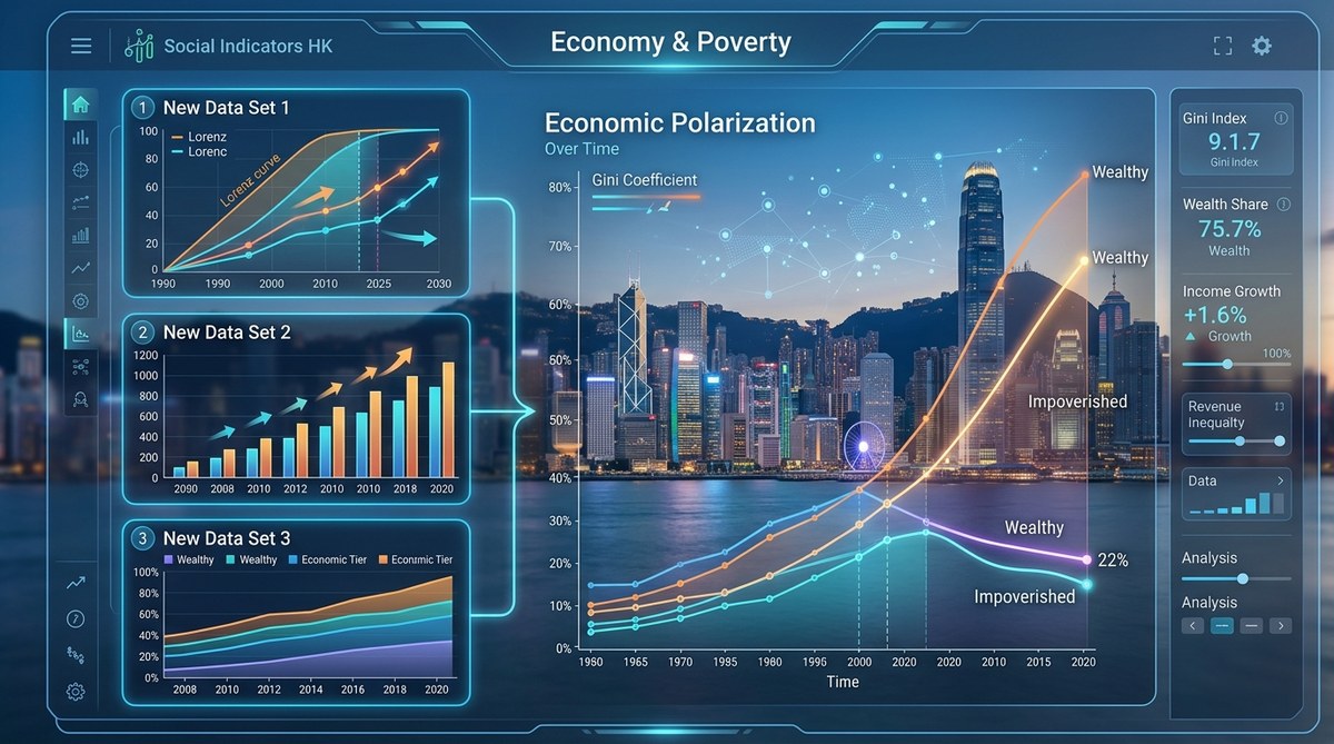
Tracking the Wealth Gap: 3 New Data Sets That Change How We Measure Economic Polarization
For years, researchers have leaned on the same handful of surveys to track the wealth gap. Those tools still matter, but they leave blind spots. They miss the very rich, who rarely answer surveys. They struggle to capture hidden assets like pension wealth or student debt. And they often fail to connect economic data with real world outcomes like health or housing stability. In 2026, three new datasets are changing that. They offer sharper resolution, better coverage, and a more honest picture of economic polarization.
Three emerging datasets are reshaping how we measure the wealth gap. The first uses administrative tax records to capture top end wealth. The second links household balance sheets to health and education outcomes. The third provides granular geographic data to show polarization at the neighborhood level. Together they reveal a more complete picture of economic polarization.
Why Traditional Surveys Fall Short
Household surveys have been the backbone of inequality research for decades. They ask people about their income, spending, and assets. But they have a well known problem: the rich do not participate.
Think about it. If you are a family earning $50,000 a year, a $100 gift card incentive might feel worthwhile. If you are in the top 1 percent, that same incentive is not worth your time. So surveys systematically underrepresent high wealth households. This creates a measurement gap that gets worse as inequality grows.
The classic Gini coefficient, for example, can appear stable while the top 10 percent pulls away from everyone else. That is because surveys miss the tail of the distribution.
A second problem is asset measurement. Surveys ask about bank accounts, home equity, and retirement funds. But they often miss complex financial instruments, offshore holdings, or business equity. And they rarely capture debt with enough detail to understand net worth accurately.
A third blind spot is geography. National surveys can tell you about the country as a whole, but they often lack the sample size to measure inequality at the city or neighborhood level. That matters because economic polarization is increasingly a local phenomenon.
These limitations are not new. But the datasets below offer ways around them.
Dataset One: Administrative Tax Records for Top End Wealth
The first dataset comes from administrative tax records. Several countries now release anonymized data from inheritance tax filings, wealth tax declarations, or capital gains records. These sources capture the very top of the distribution with far more accuracy than surveys.
What makes this dataset different
Administrative records do not rely on voluntary participation. They cover the entire population that files taxes. That means the top 0.1 percent is included, not missing. Researchers can see exactly how much wealth sits at the very top, and how that share changes over time.
For example, data from the U.S. Treasury Department’s Distributional Accounts now tracks the wealth share of the top 0.1 percent using tax records. This data shows a sharper rise in top end concentration than survey based estimates suggest. The gap between the two methods has widened since 2010.
How to use it
- Access the raw data through the relevant government agency or a research consortium like the World Inequality Database.
- Cross reference the top end estimates with survey data to calculate the “missing wealth” gap.
- Apply a Pareto distribution model to extrapolate the full wealth distribution from the top tail.
- Compare results across countries using harmonized tax record methodologies.
- Publish your findings with clear notes on methodology, so other researchers can replicate your work.
A caution
Tax records have their own biases. They only capture wealth that is declared. Offshore assets, informal wealth, and certain trusts may still be invisible. And tax law changes can create artificial breaks in the data. Always pair tax records with other sources.
Dataset Two: Integrated Household Balance Sheets
The second dataset links household balance sheets to non financial outcomes. Instead of looking at wealth in isolation, it connects assets and debts to health, education, housing conditions, and employment.
Why this matters
Wealth is not just a number. It determines whether a family can weather a medical emergency, afford a down payment, or pay for a child’s tutoring. By linking balance sheets to outcomes, researchers can see which types of wealth matter most for stability and mobility.
Some new data projects, like the U.S. Survey of Household Economics and Decisionmaking (SHED), now include detailed questions on emergency savings, retirement accounts, and student debt alongside health status and housing quality. This allows researchers to ask questions like: does owning a home protect against food insecurity, or does it just concentrate risk in a single asset?
A practical table for analysis
| Wealth Type | Typical Survey Accuracy | Link to Outcomes | Policy Relevance |
|---|---|---|---|
| Liquid savings | Moderate | Strong predictor of crisis resilience | Emergency savings programs |
| Home equity | High | Mixed (location dependent) | Housing policy, property tax reform |
| Retirement accounts | Low (valuation issues) | Moderate for elderly poverty | Pension reform, auto enrollment |
| Student debt | Moderate | Strong for young adult mobility | Student loan forgiveness |
| Business equity | Very low | Weak in surveys | Small business support |
A note on debt
Integrated balance sheets also reveal the role of debt in economic polarization. Student debt, medical debt, and predatory lending can wipe out years of savings. These datasets let you track net worth after subtracting all liabilities, which often shows a starker picture than gross assets alone.
Dataset Three: Granular Geographic Wealth Data
The third dataset provides wealth estimates at the neighborhood level. Instead of a single number for a city or state, you get data by census tract, zip code, or even block group.
Why geographic granularity matters
Economic polarization is not just about the gap between the top and bottom nationally. It is about the gap between neighborhoods that are just a few miles apart. In many U.S. cities, a 15 minute drive separates neighborhoods with median household net worth above $1 million from those with median net worth below $50,000.
This kind of spatial inequality has real consequences. It affects school funding, property values, access to grocery stores, and even life expectancy. Researchers who only look at national or state level data miss this entirely.
How to access it
Several new data products offer neighborhood level wealth estimates. The Urban Institute’s Wealth Map provides tract level estimates of median net worth, home equity, and debt. The Federal Reserve Bank of New York’s Consumer Credit Panel tracks debt and credit access at the zip code level. And the U.S. Census Bureau’s American Community Survey now includes more detailed questions on housing wealth and costs.
A bulleted list of applications
- Mapping “wealth deserts” where median net worth is below $20,000
- Identifying neighborhoods with high debt to asset ratios
- Tracking how housing price changes affect wealth concentration by race
- Evaluating the impact of local policies like inclusionary zoning
- Targeting financial education programs to high need areas
One important limitation
Geographic data can create a false sense of precision. A tract level estimate is still an average. Within a single tract, there can be large variation between households. Use these datasets to identify patterns, not to make claims about individual families.
A Step by Step Process for Using These Datasets Together
If you are a researcher or analyst looking to apply these tools, here is a practical workflow.
- Start with your research question. Are you measuring top end concentration, household financial health, or spatial inequality? Each dataset answers a different question best.
- Pull the relevant administrative tax data for top end estimates. Use the World Inequality Database or your country’s equivalent.
- Overlay integrated balance sheet data from SHED, the Survey of Consumer Finances, or similar sources. Focus on net worth after liabilities.
- Map the results using geographic wealth data. Look for clusters of high and low wealth within your study area.
- Cross validate. Where do the datasets agree? Where do they diverge? Divergence often points to measurement issues worth investigating.
- Document your methodology clearly. Transparency builds trust and allows others to build on your work.
Common Pitfalls to Avoid
Even with better datasets, mistakes happen. Here are the most common ones.
| Mistake | Why It Happens | How to Avoid It |
|---|---|---|
| Ignoring the top tail | Surveys miss it | Use administrative tax records |
| Treating gross assets as net worth | Debt is invisible | Use integrated balance sheets |
| Averaging across large geographies | Hides local inequality | Use tract level data |
| Comparing non harmonized datasets | Method differences | Document and adjust |
| Overlooking wealth type differences | Not all assets are equal | Disaggregate by type |
What This Means for Policy and Advocacy
Better measurement is not an academic exercise. It changes what we see and what we prioritize.
When you use administrative tax records, you see that top end wealth concentration is higher than previously thought. That shifts the conversation toward wealth taxes, inheritance taxes, and anti trust enforcement.
When you use integrated balance sheets, you see that student debt and medical debt are eroding middle class net worth. That supports arguments for debt forgiveness and universal healthcare.
When you use geographic wealth data, you see that inequality is baked into the landscape. That strengthens the case for place based investments, affordable housing, and community development.
The Social Indicators team uses exactly these approaches to monitor the Social Development Index. Our work on how income inequality in Hong Kong has evolved over three decades shows the power of combining multiple data sources. We also track the hidden cost of living crisis through essential expenses versus wage growth to understand how everyday costs drive polarization.
“The best inequality research does not rely on a single dataset. It triangulates. Tax records, balance sheets, and geographic data each tell part of the story. Together, they show the full picture.” – Dr. Elena Marchetti, Senior Economist at the Social Indicators Institute
Putting These Tools to Work in Your Research
These three datasets do not replace traditional sources. They supplement them. Use them to fill the gaps that surveys leave open. Use them to connect wealth to real world outcomes. Use them to show where inequality lives, not just how much there is.
The next time you start a project on economic polarization, ask yourself three questions. Am I capturing the top end? Am I measuring net worth, not just gross assets? Am I looking at the neighborhood level? If the answer to any of these is no, these datasets can help.
Start small. Pick one dataset and one geographic area. Run the numbers. Compare them to what you thought you knew. You might be surprised by what you find.
And if you want to go deeper, check out our analysis of 7 critical indicators that define poverty beyond income levels or our guide on why traditional economic indicators fail to capture social reality. The tools are here. The data is available. The only question is what story you will tell with it.




Post Comment