
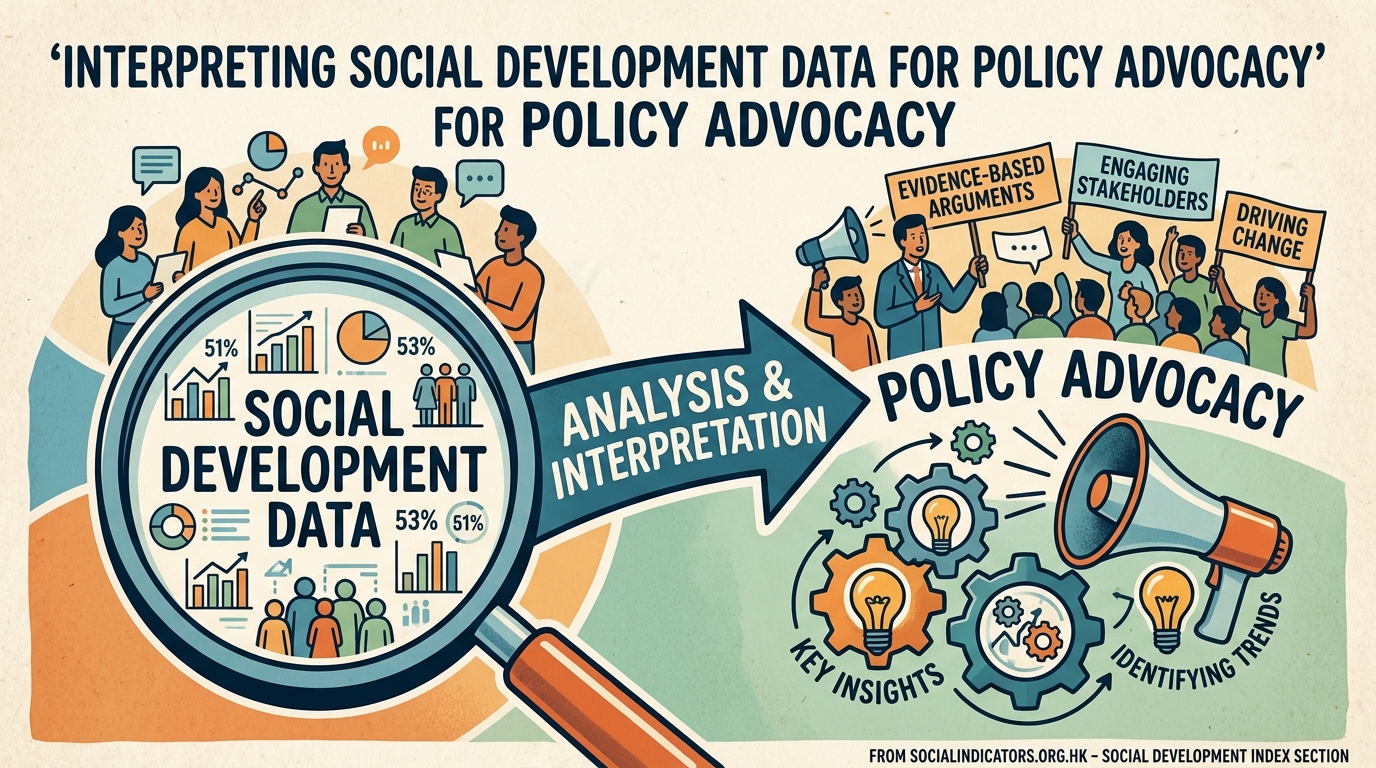
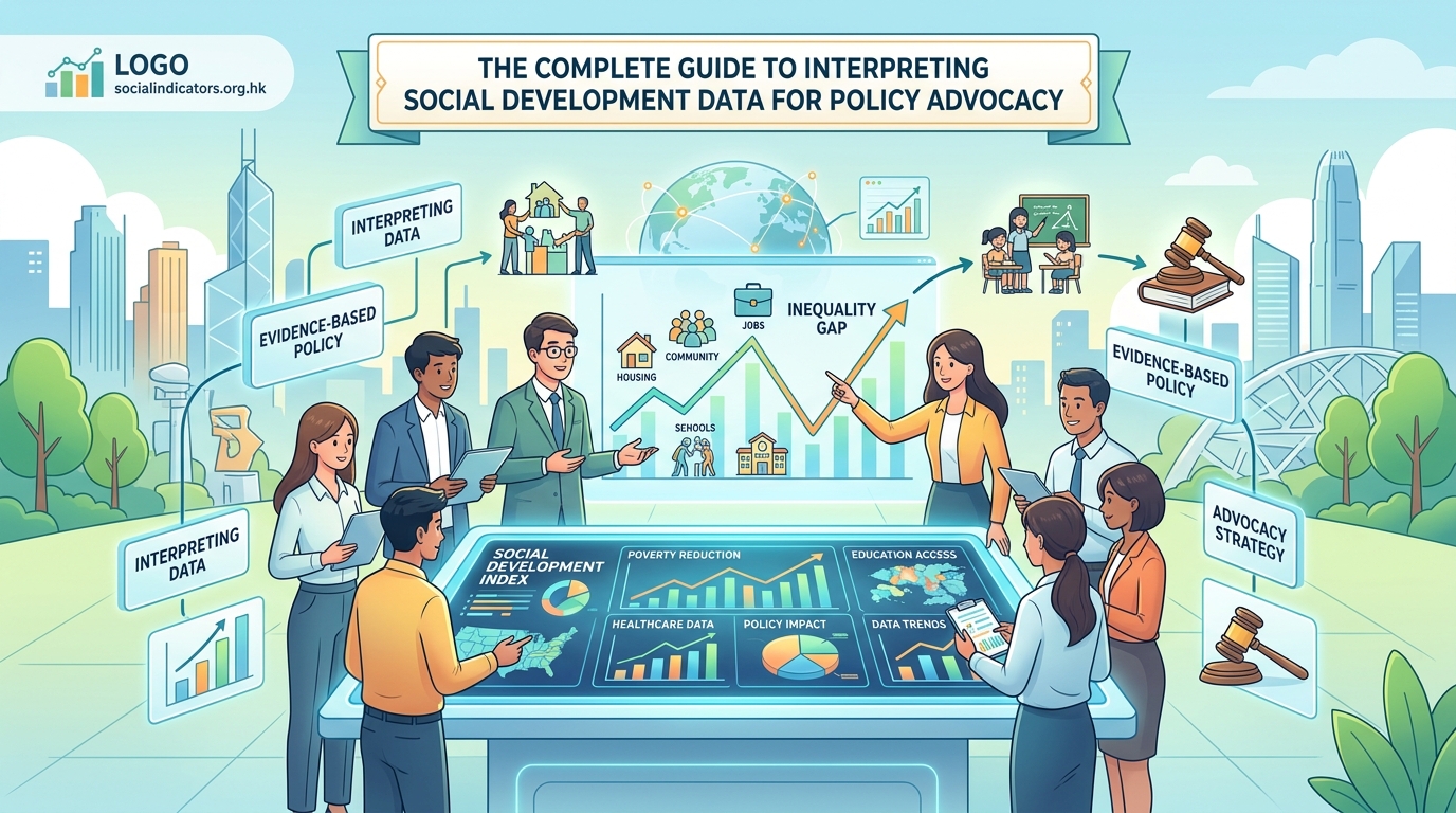
The Complete Guide to Interpreting Social Development Data for Policy Advocacy
Policy decisions shape lives. The difference between effective advocacy and noise often comes down to how well you interpret and present social development data.
Numbers tell stories, but only if you know how to read them. For policy analysts and advocacy professionals working on social issues in Hong Kong, raw statistics mean little without context, comparison, and clear communication. The gap between data collection and policy change is filled by skilled interpretation.
Effective social development data interpretation combines statistical literacy with contextual understanding. Success requires identifying meaningful trends, comparing across time and populations, avoiding common analytical pitfalls, and translating findings into actionable policy recommendations. Master these skills to transform raw numbers into compelling advocacy that drives real change in communities.
Understanding what social development data actually measures
Social development data captures how communities function and how people experience wellbeing. This includes poverty rates, educational attainment, health outcomes, housing conditions, employment patterns, and social mobility indicators.
Each metric reveals something specific. Median household income differs from mean income, and that difference matters when talking about inequality. Employment rates tell you one story, while underemployment rates tell another.
The Social Development Index synthesizes multiple indicators into a composite measure. Think of it as a health checkup for society. Individual metrics show specific conditions, while the index provides an overall assessment.
Context determines meaning. A 2% unemployment rate sounds positive until you consider discouraged workers who stopped looking for jobs. A rising homeownership rate might indicate prosperity or unsustainable debt burdens. Data never speaks for itself.
Building your interpretation framework
Start with clear questions before touching any dataset. What problem are you trying to understand? Which populations are affected? What timeframe matters for your advocacy goals?
Your framework needs three layers:
Descriptive analysis answers what is happening. You identify patterns, calculate rates, and establish baselines. This is where most people stop, but it’s just the foundation.
Comparative analysis adds perspective. You compare across time periods, geographic areas, demographic groups, or policy environments. A 15% child poverty rate means more when you know it was 10% five years ago or 8% in a neighboring district.
Causal analysis explores why patterns exist. This requires careful thinking about relationships between variables. Correlation never proves causation, but understanding correlations helps generate hypotheses worth testing.
Each layer builds on the previous one. Skip the foundation and your advocacy rests on shaky ground.
Practical steps for interpreting social indicators
-
Verify data quality and sources before analysis. Check sample sizes, collection methods, and potential biases. Government surveys, academic research, and NGO reports each have strengths and limitations.
-
Calculate relevant rates and ratios. Raw numbers rarely tell complete stories. A district with 500 unemployed people sounds worse than one with 300, until you learn the first has 50,000 residents and the second has 3,000.
-
Identify trends over multiple time points. Single snapshots mislead. Three data points reveal direction. Five or more let you distinguish genuine trends from random fluctuation.
-
Disaggregate data by relevant subgroups. Citywide averages hide disparities. Break down indicators by age, gender, income level, education, or geography to reveal who benefits and who struggles.
-
Compare against benchmarks. Use historical data, peer jurisdictions, policy targets, or international standards. Context transforms numbers into meaningful assessments.
-
Document your analytical choices. Record which indicators you selected, how you calculated rates, and why you chose specific comparison groups. Transparency builds credibility.
Common interpretation mistakes and how to avoid them
| Mistake | Why it happens | Better approach |
|---|---|---|
| Confusing correlation with causation | Patterns look convincing | Test alternative explanations; consider confounding variables |
| Ignoring statistical significance | Small samples produce unreliable results | Check confidence intervals; note when differences might be random |
| Cherry-picking favorable data | Confirmation bias is powerful | Present complete pictures; acknowledge contradictory evidence |
| Using inappropriate averages | Means are sensitive to outliers | Consider medians and distribution shapes for skewed data |
| Comparing incompatible metrics | Definitions change across sources | Verify consistent measurement methods before comparing |
| Overlooking missing data | Gaps aren’t always visible | Investigate who or what isn’t captured in datasets |
Each mistake weakens your advocacy. Decision makers spot flawed analysis, and your credibility suffers.
Statistical significance matters less in small populations. When analyzing data for a specific neighborhood or demographic group, standard significance tests might not apply. Focus on magnitude of differences and practical importance.
Turning interpretation into advocacy messages
Data interpretation serves advocacy when it connects numbers to human experiences. Start with the people affected, then add statistical evidence.
Frame findings around problems and solutions. “Child poverty increased 40% in five years” states a fact. “Four thousand more children now live in poverty, limiting their educational opportunities and long-term prospects” creates urgency and hints at policy responses.
Use comparisons that resonate. “Hong Kong’s elderly poverty rate exceeds rates in Singapore, Tokyo, and Seoul” means more to policymakers than abstract percentages.
The most effective advocacy combines rigorous analysis with clear storytelling. Let data establish credibility, but let human impact drive action. Numbers prove the scale of problems; stories prove why solutions matter.
Anticipate counterarguments. If your interpretation shows worsening conditions, expect pushback about methodology, alternative explanations, or resource constraints. Prepare responses grounded in solid analysis.
Visual presentation strategies for policy audiences
Tables work for detailed comparisons. Charts reveal trends and patterns. Maps show geographic disparities. Choose formats that match your message.
Time series data belongs in line charts. Categorical comparisons work well as bar charts. Proportions fit pie charts or stacked bars. Distributions need histograms or box plots.
Keep visuals simple. Each chart should communicate one clear point. Complex graphics confuse rather than clarify.
Label everything explicitly. Axes need units. Legends need clear categories. Titles should state the main finding, not just describe the chart type.
Color choices matter. Use contrasting colors for different categories. Avoid red and green combinations that colorblind readers can’t distinguish. Stick to colorblind-friendly palettes.
Working with incomplete or imperfect data
Real-world data always has limitations. Surveys miss hard-to-reach populations. Administrative records contain errors. Definitions change over time. Collection methods vary across jurisdictions.
Acknowledge limitations openly. Explain what your data can and cannot tell you. This honesty strengthens rather than weakens your position.
When key data doesn’t exist, use proxy indicators. If direct poverty measurements aren’t available for recent years, look at related indicators like social assistance enrollment, food bank usage, or housing affordability metrics.
Triangulate findings across multiple data sources. If three different datasets point toward the same conclusion, your interpretation gains strength despite individual limitations.
Missing data isn’t random. Think about who or what isn’t captured. Homeless populations often disappear from housing surveys. Informal workers slip through employment statistics. Undocumented residents rarely appear in official counts.
Connecting data to specific policy recommendations
Generic recommendations waste your analytical work. “Government should address poverty” accomplishes nothing. Specific, actionable proposals grounded in data interpretation create change.
Your data analysis should point toward intervention points. If child poverty concentrates in single-parent households, policies targeting childcare costs or parental leave make sense. If elderly poverty correlates with housing costs, rent subsidies or public housing allocation deserve attention.
Quantify what success looks like. “Reduce child poverty by 25% within three years” creates accountability. “Improve child wellbeing” doesn’t.
Estimate resource requirements when possible. If your analysis shows 5,000 families need housing assistance, calculate program costs. Policymakers think in budget terms.
Consider implementation feasibility. Brilliant recommendations that require massive bureaucratic restructuring face longer odds than proposals working within existing systems.
Building ongoing monitoring systems
One-time analysis produces snapshots. Systematic monitoring tracks progress and identifies emerging issues.
Establish baseline measurements before policy changes. You can’t assess impact without knowing starting conditions.
Set regular review intervals. Quarterly monitoring catches problems early. Annual reviews track longer-term trends. Match frequency to how fast conditions change.
Create indicator dashboards that display key metrics at a glance. Decision makers need accessible summaries, not dense statistical reports.
Automate data collection and calculation where possible. Manual processes introduce errors and delays. Standardized procedures ensure consistency.
Document methodology completely so others can replicate your analysis. Advocacy gains credibility when independent observers reach similar conclusions.
Collaborating across organizations for stronger analysis
No single organization holds all relevant data or analytical expertise. Partnerships multiply impact.
NGOs often have ground-level insights that official statistics miss. Academic researchers bring methodological rigor. Government agencies control administrative data. Media organizations amplify findings.
Share data responsibly. Protect privacy. Follow ethical guidelines. Aggregate individual records to prevent identification.
Coordinate messaging across coalition partners. Consistent findings from multiple sources carry more weight than isolated reports.
Different organizations reach different audiences. Academics influence policy researchers. NGOs connect with community groups. Think tanks brief legislators. Plan who communicates what to whom.
Making your case to different stakeholder groups
Legislators want constituent impact and political feasibility. Show how issues affect their districts. Explain how proposed solutions align with stated priorities.
Government officials need implementation details. Provide clear problem definitions, evidence-based solutions, and realistic resource estimates.
Media outlets seek newsworthy angles. Frame findings around human interest, unusual trends, or policy failures. Provide compelling case studies alongside statistics.
Community groups care about lived experience. Connect data to stories they recognize. Use their language and address their specific concerns.
Funders require demonstrable impact. Show how interventions based on your analysis could create measurable change. Quantify potential benefits.
Tailor your interpretation and presentation to each audience without changing underlying findings. Emphasis shifts, but facts remain constant.
Maintaining analytical integrity under pressure
Advocacy creates pressure to overstate findings or ignore contradictory evidence. Resist these temptations.
Your reputation depends on accuracy. One exposed exaggeration undermines years of credible work.
Distinguish between what data shows and what you believe should happen. Analysis reveals conditions. Values guide policy preferences. Both matter, but they’re different.
When data contradicts your expectations, investigate thoroughly before dismissing it. Unexpected findings sometimes reveal important realities.
Peer review strengthens analysis. Ask colleagues to challenge your interpretations. Invite statisticians to check your calculations. Welcome constructive criticism before going public.
Update conclusions when new data emerges. Changing your position based on better evidence demonstrates intellectual honesty, not weakness.
Putting data interpretation into practice
Social development data interpretation transforms numbers into narratives that drive policy change. The technical skills matter, but so does the communication strategy.
Start small if this feels overwhelming. Pick one indicator relevant to your advocacy focus. Track it over time. Compare across groups. Present findings to a friendly audience. Build skills through practice.
Your analysis matters most when it informs action. The goal isn’t perfect interpretation. The goal is better policy that improves lives. Let that purpose guide your work, and your data skills will grow alongside your impact.

Post Comment